I recently entered my very first painting competition - Loot Studio’s Golden Brush for the month of April - and was, I’ll be honest, extremely disappointed not to even make the first cut to twenty-four entries. At first, I honestly thought that I’d been robbed: surely this thing I’d spent a dozen hours on was at least worth being voted on by the public? However, upon reflection, I realized that - while probably pretty good by most standards - the piece I entered was, frankly, not competition ready. So in this, our first post on the painting blog, I’m going to speculate at length about what I perhaps could have done differently to get this bust to the standard it would have needed to be to make it deeper into the competition.
As we get going here, I should point out that I’m beginning this post with no clear idea as to where it’s going to go. My hope is that by taking a hard look at my own work I’ll be able to identify for myself what I need to do differently when painting for competition or display vs the tabletop.
What I Painted
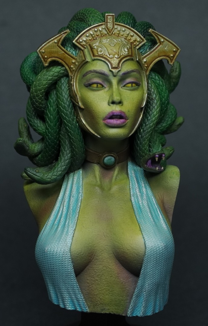
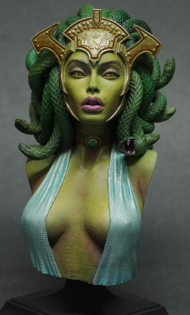
Before we dive into how I could have painted it better, we should probably start with my submission. This is the exact image I sent in to the contest organizers. I say ‘exact image’ because I think one of the things I could have improved was the photography of the piece itself, but more on that later.
This is a bust from Loot Studios’ April Release, ‘A Ghostly Odyssey’. I printed it on my Phrozen Sonic Mini 4k in Epax Hard Gray (which by the way is rapidly becoming my favorite resin of the brands I’ve tried to date) with a layer height of 0.03mm.
This is the first bust I’ve ever painted. Actually, it’s the very first object I’ve painted that wasn’t a gaming miniature. I was very proud of the skin tone, and found the interaction of greens and magentas very pleasing to my eye. I found myself stopping often to admire my handiwork during the painting process, marvelling at how easy it was to achieve complex effects on a surface area so much larger than the usual 28mm figures I’m accustomed to.
Take a Good, Hard Look
Problem the first: I fell into the trap of thinking that just because this was one of the better paint jobs I’d ever done that it was objectively good. You can see if you look closely where this no doubt caused problems with my entry.
First, the snake-hair. I phoned this in. There’s a bunch of cool contrast and light/shadow on the back of the head, but a) there’s not enough of it and b) you can’t really see it in the image I submitted so it may as well not be there at all. I didn’t try hard enough to give these snakey strands character - I treated them too much like hair, and not enough like a snarl of writhing venomous snakes.
Second, the blue metallic dress. Not enough visual interest. I’ve seen other versions of this bust now where the dress is made more interesting with freehand, or painted to appear translucent, or made visually interesting in some other way. I needed to do more with this than tint some Vallejo White Aluminum with blue ink and shade the recesses. I also may have been slightly off the mark in the exact color I chose for this. It may have been wise to aim for an ever so slightly greener tone here, as this blue is right on the edge of disharmony with the rest of the colors on the model.
Third, the eyes. I wanted reptillian-looking snake eyes to add to the cold, menacing attitude of this character, and I kinda-sorta pulled it off. But it could have been - should have been, even - much tidier. Eyes on 28mm figures are usually a dot, if that, of black in a white oval, and painting them at this scale was not something I was fully prepared for the complexity of.
Fourth, the crown. I wish I’d done this in non-metallic gold instead. I really should have. Personally, I think a good-looking TMM is just as aesthetically pleasing as NMM, and in some cases it’s better and more believable, but for a competition entry it almost seems like unless your piece is doing something exceptional with metallics, you had better be prepared to do the work for an NMM effect.
So that’s four things I can spot for myself that I didn’t do as well as I probably needed to in order to give myself a realistic shot at making the voting rounds of this contest. I have no doubt whatsoever that there are even more that seasoned display painters would find, but if I’d even gone through this exercise myself prior to submitting the photo, I could have improved my chances for sure.
The Finished Product
I don’t know who said it first, but something you may also have come across is the idea that the finished product of a miniature painter isn’t a painted miniature: it’s a photo of a painted miniature. I first heard this in an episode of Vince Venturella’s Hobby Cheating series, but I’m not sure if he was quoting someone else or if this is a Vincey V original. Anyway - remember that picture from earlier? Check this out:
This is the same bust, with the same paint on it, taken a day later after I played around with the ISO/f-stop/shutter speed of my Sony a6600 in manual mode with some slight adjustments to the position of my light source. The difference is (har) night and day! The second image is more in focus, the colors more accurate, the angle more flattering - everything about this picture is better than the one I actually sent in as my entry. An unforced and totally avoidable error on my part. I at least kind of know how to take pictures of minis - I even bought a very nice mirrorless camera last year almost expressly for this purpose - so why did I settle for that first picture? Who knows.
Don’t make this mistake, folks. You spent hours and hours painting something, so spend fifteen or twenty minutes getting the best possible picture of it to share with the world instead of using one that’s ‘good enough’.
Choosing Your Subject
Looking to wrap this up, it dawned on me that when I first started painting this bust, I was just painting it for my own enjoyment. It wasn’t until later on in the process that I thought “Hey, I can enter this in that contest they emailed me about!”. In hindsight, this may have been the root of some of my other issues. I was already well past the point of base layers and color choices when I decided I’d submit this thing, and when you think about it that’s a pretty obvious way to end up with a finished product that’s less than it could have been. I could have used digital editing software to play with color schemes, come up with some interesting ways to add contrast and variety, done hours of research on ‘how to paint reptile eyes’, and so on. Not having that opportunity undoubtedly translated to a result that was not the very best it could have been.
Also, this contest is run by Loot Studios, who - if you’re not familiar - are a subscription service for STL files you can print with your SLA printers at home. (They aren’t paying me to say this, but I’ll say it anyway: their models are some of the best available for home printing, period.) The contest was limited to models available in the release for that month and that month only, which meant that I knew with some degree of certainty which figures people would be submitting for this competition. Can you guess which piece was the most popular? Yep, this Medusa bust. Fully one third of the entries that made it to the voting rounds were this exact model. Choosing the most ‘obvious’ piece as my entry invites direct comparison against other contestants who are, frankly, better at this than I am. In the future, I’m going to be more thoughtful about what I paint for competitions like this one to avoid that potential pitfall. Unless, of course, I feel like I can absolutely knock the painting out of the park on something.
Gotta play to your strengths, right? For me, that might be basing, honestly: next time I might go with a 75mm figure on a scratchbuilt display base instead of a bust. We shall see!
Wrapping it Up
Hopefully this post is useful to any other aspiring display painters out there. As I’ve said, this is new territory for me, and I’ve only just begun to try and add the more thoughtful, artistic, and technical touches that display pieces require. I will say that in terms of how much I enjoyed the process of painting for display, even though my first outing was not a resounding success, that it may become my main focus sooner or later. There is just something deeply satisfying about painting a thing just to paint it, to appreciate it for its aesthetics alone rather than its utility as a monster in your RPG session, or points in your warband.
If you’ve thought about getting into it and haven’t yet, you absolutely should - it’s a lot of fun, and even when you don’t win you will definitely learn something.
Bonus Pics
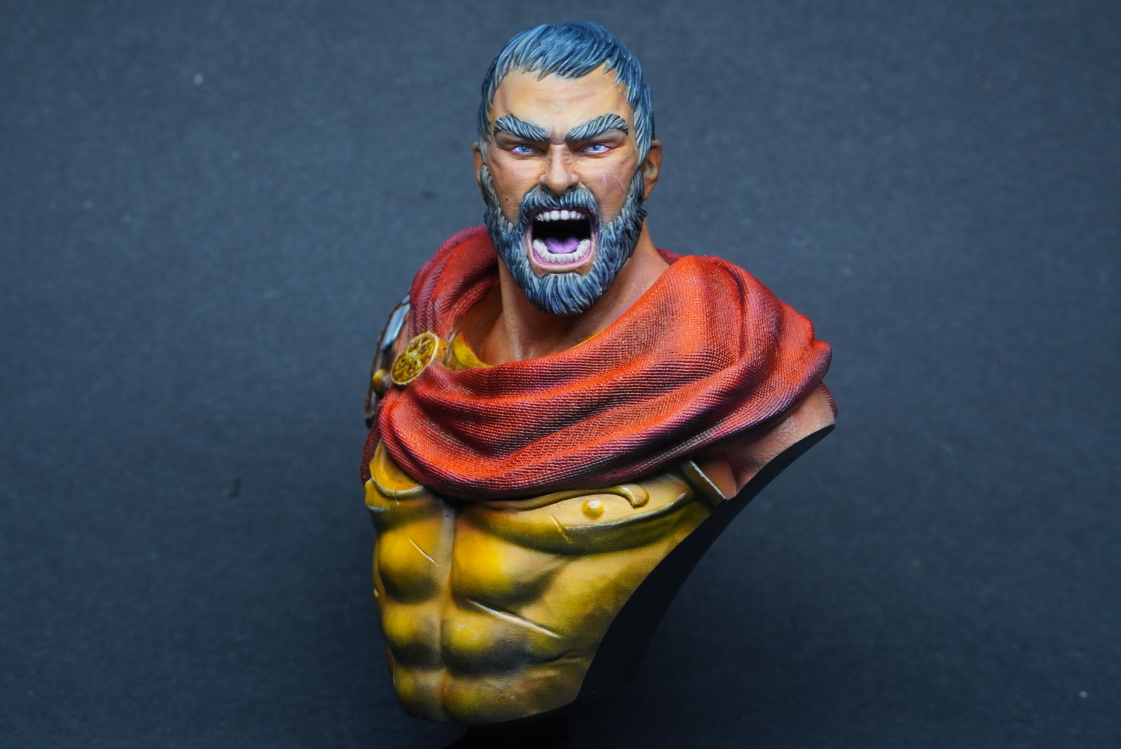
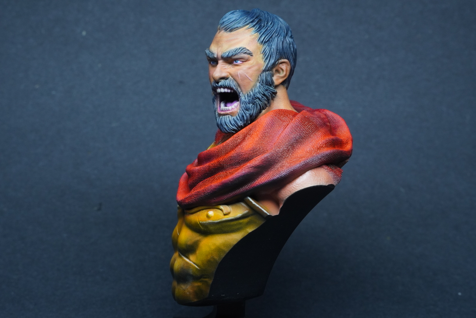
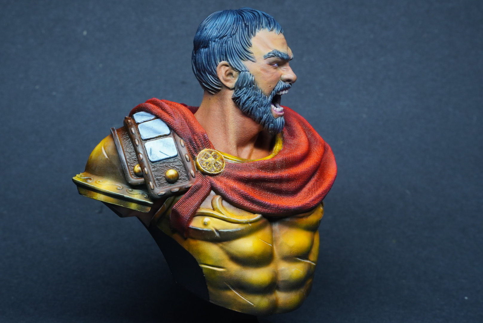
I had so much fun painting that first bust that I printed and painted another one from the same collection. You can see on this one that I did a few things differently, some of them informed at least a little by that self-critique I talked about earlier.
